GraphPad provides full support for Macs; the powerhouse, Prism, is now a Cocoa program for full OS X wonder and future-proofing; its default file format is interchangeable with previous versions and the Windows version. While Prism emphasizes biostatistics for laboratory work, it can be used by people in other fields easily enough.
Prism’s focus appears to be guiding people through specific types of analyses based on the data they have; it is less useful for exploratory work or times when you have a huge database with plans to do all sorts of odd things.
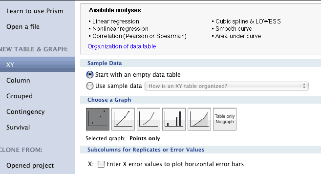
Starting out, you choose the type of graphing or analysis you will want, and then create an empty data table which you can fill with data copied from a spreadsheet or imported from various open-source formats (not Excel). If you choose wisely, which can take some education or trial and error, you will get the option of doing the analysis you want, and the program will be extremely fast (at least on our Intel-based early Mac Pro.)
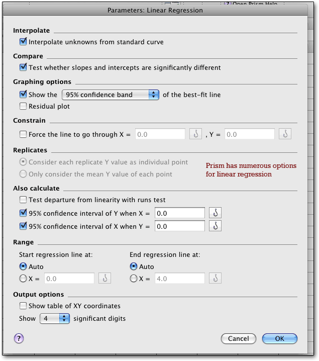
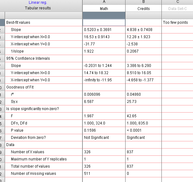
Once you click on the picture of a line (or select the regression option from the menu), you get a host of choices, allowing most of the options you may need; but not allowing for forward, backward, or similar options, or for pairwise vs listwise deletion of missing values, or any of the more esoteric alternatives. The results are easy enough to read and can be copied and pasted into a spreadsheet, providing the slope and intercepts with errors, along with numerous dandy statistics. Data Set C was empty, in case you were wondering. Missing from action are adjusted R-square and a model including both y-variables.
We hadn’t originally noticed a row of tabs along the bottom row, which provide access to extra features including a lab workbook for making notes as you go along, and the automatically generated scatterplot, which provides information on specific data points if you put the mouse over them. Considering that the analysis was lightning-fast in this case, we were surprised to find the plot had been drawn! Prism is speedy indeed.
![]()
The tab just to the right of the highlighted scatterplot tab is for putting several plots or other features onto the same page for comparison or convenient printing. (The tabs are duplicated by a navigation panel on the left side of the screen.)
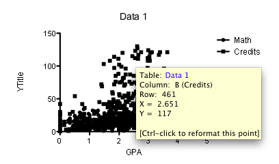
This is the default; there are numerous color schemes, none of which are particularly useful, and you can create your own color schemes, which is very useful if not particularly unusual. Impressively, the graph is linked to the actual data, so if you change the data, the results and the graph instantly update. If you change the analysis parameters, the graph also updates. As Harvey Motulsky wrote, “Results are not static text files, but a live part of the document. So you can try different parameters...” (as we describe later).
What’s even more impressive is the amount of control you get over the scatterplot, which is far easier to access than in most graphing programs and far, far easier than in SPSS. For example:
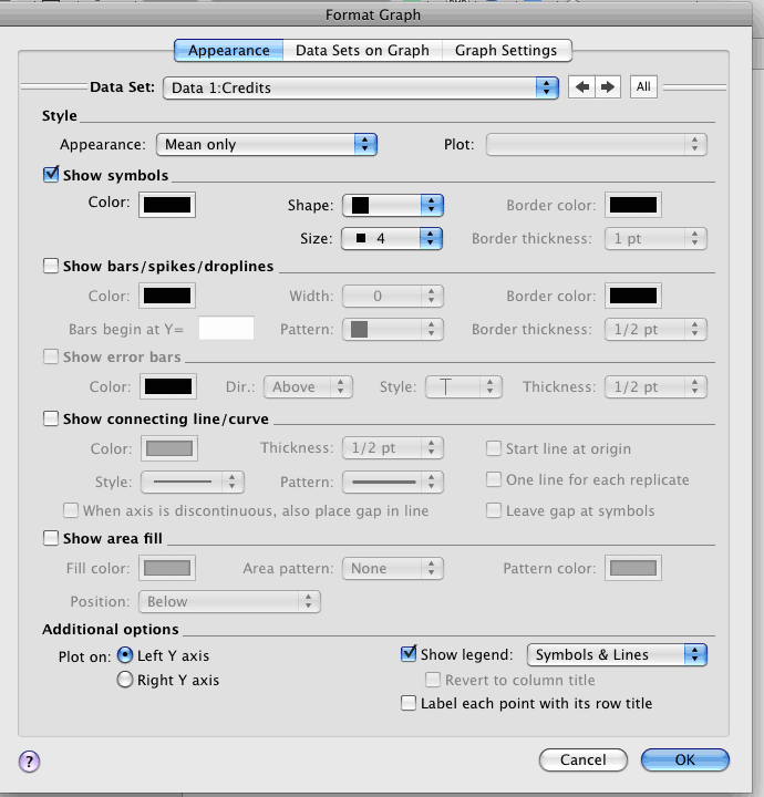
Using this window and guessing at other methods, we were able to convert the hard to read chart above into something far better in less than 90 seconds, the first time we ever tried to make any changes, with no recourse to help or manuals (though the online help is actually useful and available by pressing on the question-mark):
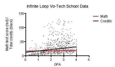
And from this we learn that our data had little of value to offer us... GPA seems pretty much unrelated to math test scores, and only weakly related to total credits; more importantly, we have a much clearer idea of what’s going on in reality, which is that those with a GPA of less than around 1.5 have very low total credits (presumably they get discouraged and leave, or get thrown out), which provides us with more actionable data than the regression numbers. Wow, this program is fast once you get past that first hurdle of figuring out how to get started! Which is probably why they have a video to kick-start new users. Still, you really have to plan ahead - which you should be doing anyway in most types of research.
Nonlinear regression is even more impressive — the list of options is much better than one gets in most statistical programs, and shows the focus of Prism on its chosen field.
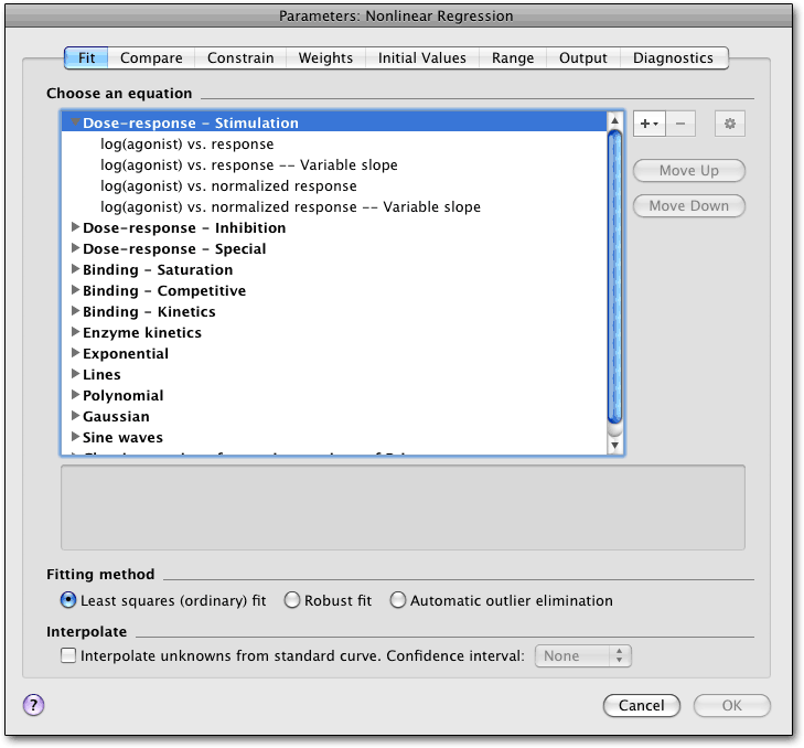
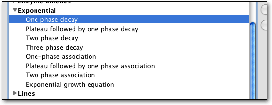
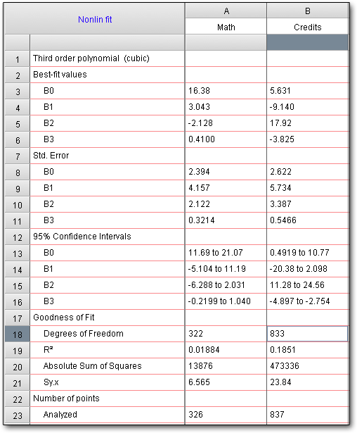
Since I’m not a biochemist, I went down to the polynomial area, which allows up to sixth-order polynomials (exponential is shown below).
It turns out that my data likes polynomial regression; R-squared rose for both variables, albeit not to terrific levels. The interplay between credits and GPA shows up better, though! (A third-order polynomial effect had stronger results than second-order. I didn’t use automatic outlier removal because that does not look like an issue, but it is a good feature to have.)
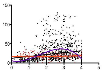
Then we take a quick look at the graph; the purple line is the polynomial effect for credits, the orange (hardly changed) for test scores. That reflects the smaller numbers of credits for students with a 4.0 GPA, which is (statistically) harder to maintain as one takes more classes — any non-A grades drop students down below 4.0. Knowing that, we can see that perhaps a third-order polynomial effect is a little misleading, at least in the strength the computer shows us, even though the R2 went from 13% with a second-order effect to 18.5%. (Warning: this is exploratory work and the methods used are breathtakingly casual, and are not suitable for serious research.) Without the plot, which apparently took no time whatsoever to draw, we would not have seen this problem.
So let's say you've chosen an appearance like this one, and you want to use it in the future, and you miss Cricket Graph's graph styles — we missed it the first time around, but the people at GraphPad noted that you can make some changes the default via the program preferences, or you can simply clone a graph and add new data. It's not quite as easy as in Cricket Graph, but then, Prism is far more powerful and provides even more options. We also don’t recall Cricket Graph having a zoom feature.
If you want to re-run an analysis with different options, you can right-click in the data window or press cloverleaf-T; it's quick, easy, and very useful.
Likewise, using Prism’s scripting language, you can analyze a large number of files automatically; the language is able to open and close Prism files, import data, and export or print results and graphs. Prism scripts can be called from other programs, as well, including Office (via VisualBasic). The language allows for loops, and has a limited ability to change data tables; most people probably will never need to use it, but for those who do, I suspect it will be invaluable.
Unlike some ported software (SPSS 16!), GraphPad Prism lets you easily copy and paste data and graphs to and from Excel, Keynote, Pages, Word, etc. — it’s a full member of the Macintosh world. Graphs can be exported as PDF, EPSF, TIFF, JPEG, PNG, Windows Bitmap, or the ancient PICT (bitmap version); you can choose resolution, colors, etc., and can either send each graph or layout to one file, or send them all to their own separate files. There’s also a new XML-based format for exporting data and findings, along with the usual tab and comma delimited formats. (One note from GraphPad: Prism uses PDF for copying and pasting, but versions of Word and Powerpoint before 2008 don’t recognize it and use a 150 dpi bitmap; so you may want to export the files to TIFF and then import them, or make the graphs double-size and then paste so the bitmap is at high resolution. In PowerPoint 2008, use Paste Special and select PDF instead of just pasting, which will use a bitmap. Word 2008 apparently works without any need for trickery.)
Data analysis is aided by the usual manipulation tools, such as transposing, missing value estimation, and excluding particular cells. In addition, a wide range of transformations are available, including logs and user-created calculations.
The program automatically takes the first value in each column of pasted data and makes that the data label, saving one step. Those with more than one monitor may appreciate that each window has its own toolbar, Windows-style (and iWork-style) — as well as a central Mac-style menu. Likewise, those who work on data with other people may be interested in knowing that Prism configurations can be shared in a group (including user-defined equations); likewise, the program can be used by different people on the same computer, with different configuration files for each person. This kind of thoughtfulness shows a responsive programmer team.
The focus of Prism follows naturally from its creation story: it was written by Harvey Motulsky to help him to analyze his own data (a creation story not unlike some of the statistical powerhouses of the past and present). Now, a dedicated team of six Mac programmers work on the Mac versions; Harvey claims not to have written any code for 15 years. With version 5, Prism was put into Cocoa. GraphPad’s other major statistics program, InStat (review coming someday), is based on Prism but has a different focus; it has not been updated for a while, and runs under Rosetta on Intel Macs (natively on PowerPC models). Our brief tests of InStat showed it to be fast on our MacBook.
What Harvey did not have to include, and we’re glad he did, is a handy guide to statistics, which describes when to use one test or another, helping those whose graduate school days are long in the past — and those who specialize in one approach but sometimes need to go into another. That, and the “analysis checklist” button (which provides a review of “things to think about before accepting the analysis”), are especially handy for those who haven’t kept up to date, or who are moving into new areas.
Another plus is the huge knowledge-base, with over 1,300 articles, which shows some dedication to after-sale support. Common statistical questions are listed along with bugs, problems, and workarounds (e.g. all those Office pasting issues, which arise from defects in Office rather than Prism).
Prism is well suited to the work it was designed for, if a bit frustrating for the first five or ten minutes of usage before one gets used to the modus operandi. (Among other things, we didn’t realize that, for t-tests, you need to create a column table and enter data into two columns - the columns define the groups. You can't use value labels, and you can't enter non-numeric data, but this at least gets you there.) If you’re in the target audience, you may find it very natural to work with Prism. If you’re not, you may find that while the program is fast, the methods you have to use slow you down. A lot depends on the nature of your work; if you’re “playing with data” (doing exploratory work post-hoc), which you’re usually not supposed to do anyway, Prism may not be the best tool. If you followed the rules and are doing planned analyses, it may be faster than a big (and slow) dog like SPSS.
The results are clearly presented and it is remarkably easy to get the desired results; and Prism is fast, leaving other programs in the dust. Prism is both powerful — again, within its constraints and focus — and easier to use than most programs of similar power. More than anything, we found Prism to be remarkably fast, and commend the writers for putting code optimization ahead of empty features.
We tested Prism on a Mac Pro and a MacBook using a dataset with 2,000 cases.
Sponsored by Toolpack Consulting • Related Videos
Copyright © 2005-2026 Zatz LLC. All rights reserved. Created in 1996 by Dr. Joel West; maintained since 2005 by Dr. David Zatz. Contact us. Terms/Privacy. Books by the MacStats maintainer