
by David Zatz, Ph.D.
Correlations look for a linear relationship: they measure how much you can be sure that as one thing goes up, another goes up (or down). Correlations are shown with a number called “r.” r goes from 1 to 0, and from –1 to 0; a negative correlation means “as this goes up, that goes down.” 0 is for two variables that have zero relationship; 1 or –1 is for variables where if one goes up, we know for certain the other will also go up (or down).
If you square r, you get R2, as you’d expect (other than the capitalization of r). R2 has a special meaning: it is the percentage of variance in one thing you can explain, using the other thing. Example: I can explain 64% of city fuel economy in a car, if I know the weight; because the correlation between weight and city mpg is (r=0.80).
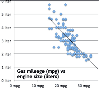
Think about a chart like this one (a scatterplot). If you draw an imaginary line, you can figure out how far each point is from the line. Some will be right on it (0 distance), others will be further away. A correlation draws a line, then measures how far points are from the line. The higher the correlation, the closer the points are to the line.
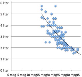
Correlations only measure linear (straight-line) relationships. If your data has a bit of a curve to it, as with the line to the right, you can get a logarithm or one of your variables to compensate. (There are also polynomial adjustments you can make.) We won’t be doing either of those, but you should know these exist.
One example of a curved relationship is IQ test score and income; as IQ rises, income rises, until suddenly income starts to fall as IQ rises, forming an upside-down (“inverted”) U shape. A correlation or regression might completely miss that relationship. This is why, if you can, you should always do a scatterplot. Sadly, scatterplots are usually impossible to read properly when you’re using survey data, because when you combine one five-point scale with another, you just get 25 dots.
Correlations are easy to do. They are also easy to do wrong. Two examples of correlations that will never make sense are gender vs race, and religion vs religion.
The computer will happily run these for you, if you have numbers representing gender, race, etc (e.g. 1=male, 2=female); but the numbers will be meaningless. As one gets more female, does one also become more Asian? The idea is meaningless.
Always remember the idea behind what you are doing, and you will not make these all too common mistakes.
You may ask, how do I know if two things are really related, and the correlation is not due simply to chance? That is an excellent question, and it is why we have a way to calculate the statistical significance of correlations. Basically, it is:
r ÷ (square root of: (1–R2) ÷ (sample size minus 2)
The key here is that as r rises, and as the sample size rises, it becomes easier to say “this result is not due to chance.”
Here’s a video; in Safari it looks small because it has to fit into this column, but you can resize it to full screen. May not work correctly in all versions of Safari - try Firefox.
In SPSS or PSPP, use the Analyze menu and select Bivariate Correlations. Move the variables you want from the left-hand list into the one field you will see.
In JASP or Jamovi, go to the Regression menu, select Correlation (in JASP, under Classical), and move the variables you want from the left-hand list to the Variables field.
If you are trying to support a theory you already have, and you are only testing to see if it will be significant if it is positive or if it is negative, you can click on “one-tailed” in SPSS or PSPP, or click on “Correlated positively” or “Correlated negatively” in JASP or Jamovi.
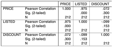
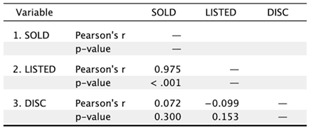
The first line is the correlation (e.g. listed vs sold = 0.975 which is quite high). The second line is the significance–the odds that this finding is just due to random chance, which you want to be pretty low, e.g. under 0.01. The third line, if it’s printed (you should ask for this by clicking Sample Size in JASP or Jamovi), is the number of cases in each correlation.
Often, there will be missing values for one or both variables; this is the number of cases where you have valid values for both variables. SPSS and PSPP print each number twice—sold vs listed is the same as listed vs sold; JASP kills the duplicates.
In these examples, the discount is not significantly related to the sales price or listed price, but that the listed price explains 0.9752 (95%) of the variance in the sales price—and vice versa.
Correlations do not show cause and effect relationships; you have to do that with your theory (e.g. that the final sale price does not affect the list price, but the list price causes the final sales price). Sometimes, one thing may not cause another; they might both be caused by something else entirely (e.g. time at the beach causes higher soda intake and higher rates of skin cancer; a correlation may suggest that soda intake causes skin cancer).

Copyright © 2005-2026 Zatz LLC. All rights reserved. Created in 1996 by Dr. Joel West; maintained since 2005 by Dr. David Zatz. Contact us. Terms/Privacy. Books by the MacStats maintainer